


Table of contents
- Goal:
- Getting Started
- Define Basic HTML Components/Structure
- Create the Main Structure of the Single Price Grid Component
- Add the Footer Section
- Styling With CSS
- Style the Universal Selector (*)
- Style the body element section.
- Give H4 and the P Tags the Necessary Margin
- Style the Different Classes
- Fix Mobile Responsiveness To Adjust the Styling According to Device Size
Goal:
In this tutorial, you will learn about how to use basic HTML and CSS to create and design a highly responsive single price grid component. This is a very beginner-level challenge from frontend mentor. The main assignment is to build out this landing page based on the designs provided in the starter code. Your users should be able to:
- View the optimal layout for the page depending on the screen size
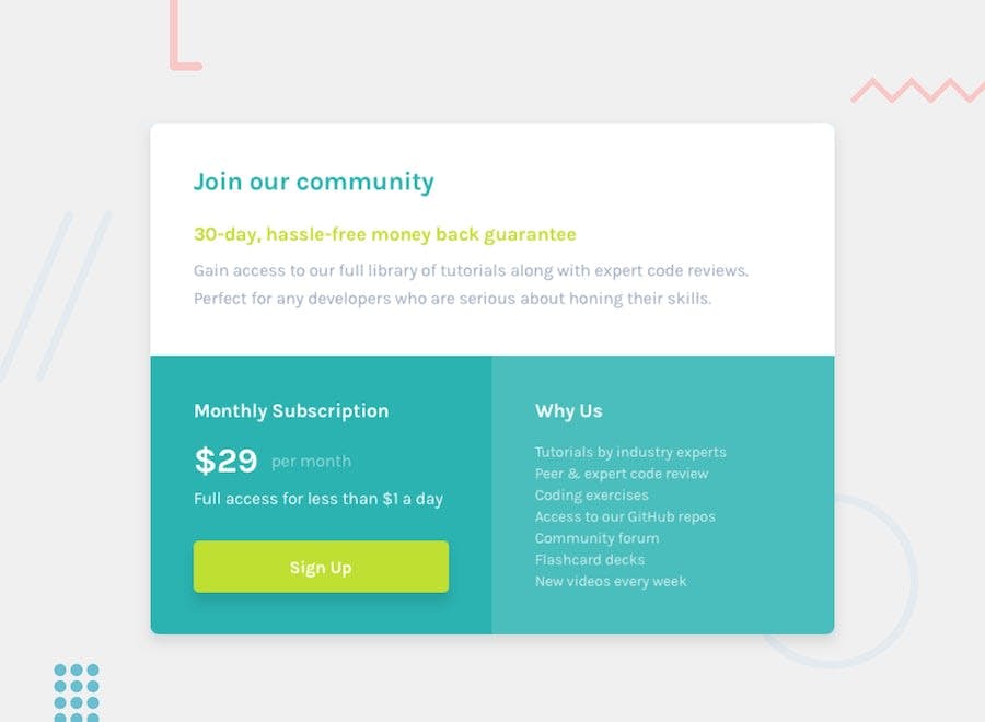
Desktop View:
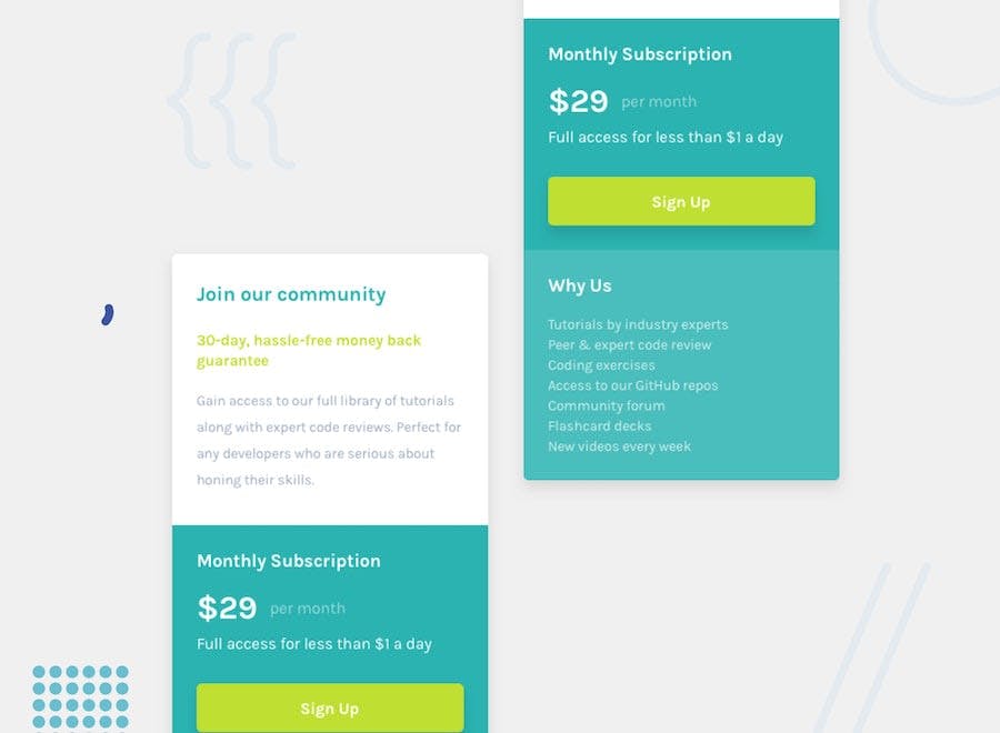
 Mobile View:
Prerequisite: - Basic knowledge of HTML and CSS.
Getting Started
For some people, this challenge might be a walk in the park such that you can easily do with your eyes closed, while some it might be challenging and you will be learning one or two new concepts from. So, whether you are a beginner or a pro, this tutorial will be of great health to further develop your skills.
The first step is to use HTML to create a rough draft or blueprint of the single price grid . A single price grid Component's appearance and feel will then be created in accordance with the Design using CSS.
Define Basic HTML Components/Structure
This defines the project type as HTML and gives it the language English.
   <!DOCTYPE html>
    <html lang="en">
    </html>
Now define the head tag within the HTML tag.
    <head>
       <meta charset="UTF-8">
      <meta name="viewport" content="width=device-width, initial-scale=1.0">
      <link rel="icon" type="image/png" sizes="32x32" href="./images/favicon-32x32.png">
       <title>Single Price Grid Component</title>
    </head>
Just below the head tag, create a body tag.
  <body>
</body>
After this step, your code should look like this:
<!DOCTYPE html>
<html lang="en">

<!-- Head Section-->
<head>
  <meta charset="UTF-8">
  <meta name="viewport" content="width=device-width, initial-scale=1.0">
  <link rel="icon" type="image/png" sizes="32x32" href="./images/favicon-32x32.png">
  <link rel="stylesheet" href="style.css">
   <title>Single Price Grid Component</title>
  </head>

<!-- Body Section-->
<body>
</body>
Create the Main Structure of the Single Price Grid Component
As you can see in the design there are three main sections, One section has a white background, the second with a cyan background and the third section with a light cyan background. So what we do is:
- First, we divided the three sections as header sections for the white background, price section for the cyan background and why us for the light cyan.
- Then we wrap those three sections inside a parent container called `container`.


<!-- Parent Wrap-->
<div class="container">
   <!-- white background-->
   <header id="main-header">
   </header>
   <!-- cyan background Section-->
   <div class="price">
   </div>
<div class="why-us">
   </div>
</div>
We are now done developing the main structure for the single price grid component. It is time for us to work on each section and fill them with the necessary contents.
- As you can see, the white background has taken the full container. Therefore what we do is instead of using white as an we use a background color to fully cover the background and we then input the provided content.
- When we move to the second section, there is a heading and a subheading, then we have the paragraph and underneath we have a call to action (CTA) button called sign-up.
- For the third section, we have the heading and the body text.
At the end of this section, your code should be very similar to this
<div class="container">
<header id="main-header">
<h4 class="primary">Join our community</h4>
<p class="secondary">30-day, hassle-free money back guarantee</p>
<p class="gray small-text">
Gain access to our full library of tutorials along with expert code reviews.
Perfect for any developers who are serious about honing their skills.
</p>
</header>
<section id="price">
<h4>Monthly Subscription</h4>
<p><span class="large-text">$29</span><span class="off-white">   per month</span></p>
<p class="small-text">Full access for less than $1 a day</p>
<a class="btn" href="#">Sign Up</a>
</section>
<section class="why-us">
<h4>Why Us</h4>
<p>Tutorials by industry experts</p>
<p>Peer & expert code review</p>
<p>Coding exercises</p>
<p>Access to our GitHub repos</p>
<p>Community forum</p>
<p>Flashcard decks</p>
<p>New videos every week</p>
</section>
</div>
You can copy the content in the above code from my github repository.
Add the Footer Section
<footer>
    <p class="attribution">
      Challenge by <a href="https://www.frontendmentor.io?ref=challenge" target="_blank">Frontend Mentor</a>.
      Coded by <a href="#">Christiana Ojo</a>.
    </p>
  </footer>
— — And with that, we are done with the html blueprint. It’s time for us to check the output.

Here is the output of our HTML code, and it looks quite ugly??? But wait, don’t judge too soon, it is just the beginning and the best part is yet to come. In the following section, we will be adding CSS to our application, let's delve in:
Styling With CSS
We have reached the best part as we are now ready to add color and style to our project, it’s time to get our hands dirty as we will be styling the desktop view first. This means we'll start the styling for the mobile view first and then we’ll adjust the styling for the smaller screens using media queries.
Import the External Style Sheet into the HTML file
<link rel="stylesheet" href="style.css">
This line of code will link the CSS styling with our html file.
It’s now time to create our CSS file style.css as defined in our HTML file.
Import external fonts into the CSS file
@import url('https://fonts.googleapis.com/css?family=Karla&display=swap');
Use ::root to declare the colors you will be using.
:root {
  --light-gray: hsl(204, 43%, 93%);
  --cyan: hsl(179, 62%, 43%);
  --off-cyan: hsla(179, 62%, 43%, 0.699);
  --bright-yellow: hsl(71, 73%, 54%);
  --grayish-blue: hsl(218, 22%, 67%);
}
You may be thinking it is easier to just input the colors at every point so why use ::root?
- The :root CSS pseudo-class matches the root element of a tree representing the document. Also, :root is where you have declared and initialized the global vars that you can reuse throughout your stylesheet.
- Here the
var()function is used to insert the value of a CSS variable. When you use CSS variables it has access to the DOM, which means that you can create variables with local or global scope, change the variables with JavaScript, and change the variables based on media queries. - We will be using
:rootrather than copy and paste the colors over and over again, so we can simply place them in the variable and reuse thevar()value throughout the stylesheet. It’s simple and easy.
Style the Universal Selector (*)
we are using a universal selector (*) to act as the default styling throughout the page. Therefore rather than repeating the same styling in every class, we can simply define the styling in a universal selector once and it will serve as the default styling throughout the page.
* {
  margin: 0;
  padding: 0;
  box-sizing: border-box;
  line-height: 1.6;
}
Style the body element section.
It's now time to add color, background, and give the design style inside of the body element.
body {
  font-family: 'Karla', sans-serif;
  background: var(--light-gray);
  height: 100vh;
  padding: 5rem 2rem;
}
Give H4 and the P Tags the Necessary Margin
h4, p {
  margin: 1rem 0;
}
Style the Different Classes
.primary {color: var(--cyan); }
.secondary {color: var(--bright-yellow);}
.gray {color: var(--grayish-blue);}
.off-white{color: rgba(255, 255, 255, 0.705);}
.large-text{font-size: 1.5rem;}
.small-text{font-size: .9rem;}

/*button*/
.btn {
  display: block;
  text-align: center;
  color: #fff;
  font-weight: 600;
  width: 100%;
  background: var(--bright-yellow);
  padding: .5rem 1.25rem;
  text-decoration: none;
  border-radius: 8px;
  box-shadow: .1rem .1rem .9rem .2rem  rgba(92, 90, 90, 0.25);
}
.btn:hover {
  background: var(--light-gray);
  color: var(--cyan);
}

/* class container */
.container {
  background: white;
  border-radius: 5px;
  box-shadow: .1rem .1rem .9rem .2rem  rgba(150, 148, 148, 0.25);
}

.container #main-header {
  padding: .15rem 1rem;
}
/* Price Section */
.container #price {
  background: var(--cyan);
  padding: .15rem 1rem 1.5rem 1rem;
  color: #fff;
  border-bottom-left-radius: 4px;
}
/* Why us */
.container .why-us {
  background: var(--off-cyan);
  padding: .15rem 1rem .5rem 1rem;
  color: #fff;
  line-height: 0;
  border-bottom-right-radius: 4px;
}
.container .why-us p {
  font-size: .9rem;
  line-height: .15;
  color: rgba(255, 255, 255, 0.705);
}
Fix Mobile Responsiveness To Adjust the Styling According to Device Size
For the style for mobile responsiveness, we will be using @mediaquery tag
@media screen and (min-width: 594px) {
  body {
    max-width: 700px;
    margin: 0 auto;
  }
  .container {
    display: grid;
    grid-template-columns: 1fr 1fr;
    grid-template-rows: 200px 250px;
  }
  .container #main-header {
    grid-column: 1 /span 3;
    padding: 1rem 2rem;
    justify-content: center;
  }
  .container #price {
    padding: .75rem 2rem;
  }
  .container .why-us {
    padding: .75rem 2rem;
  }
  .container .why-us p {
    line-height: .4;
  }
}
Conclusively, your CSS code input put together should look like this
@import url('https://fonts.googleapis.com/css?family=Karla&display=swap');
:root {
  --light-gray: hsl(204, 43%, 93%);
  --cyan: hsl(179, 62%, 43%);
  --off-cyan: hsla(179, 62%, 43%, 0.699);
  --bright-yellow: hsl(71, 73%, 54%);
  --grayish-blue: hsl(218, 22%, 67%);
}

* {
  margin: 0;
  padding: 0;
  box-sizing: border-box;
  line-height: 1.6;
}
body {
  font-family: 'Karla', sans-serif;
  background: var(--light-gray);
  height: 100vh;
  padding: 5rem 2rem;
}
h4, p {
  margin: 1rem 0;
}

.primary {color: var(--cyan); }
.secondary {color: var(--bright-yellow);}
.gray {color: var(--grayish-blue);}
.off-white{color: rgba(255, 255, 255, 0.705);}
.large-text{font-size: 1.5rem;}
.small-text{font-size: .9rem;}
.btn {
  display: block;
  text-align: center;
  color: #fff;
  font-weight: 600;
  width: 100%;
  background: var(--bright-yellow);
  padding: .5rem 1.25rem;
  text-decoration: none;
  border-radius: 8px;
  box-shadow: .1rem .1rem .9rem .2rem  rgba(92, 90, 90, 0.25);
}
.btn:hover {
  background: var(--light-gray);
  color: var(--cyan);
}


.container {
  background: white;
  border-radius: 5px;
  box-shadow: .1rem .1rem .9rem .2rem  rgba(150, 148, 148, 0.25);
}

.container #main-header {
  padding: .15rem 1rem;
}
/* Price Section */
.container #price {
  background: var(--cyan);
  padding: .15rem 1rem 1.5rem 1rem;
  color: #fff;
  border-bottom-left-radius: 4px;
}
/* Why us */
.container .why-us {
  background: var(--off-cyan);
  padding: .15rem 1rem .5rem 1rem;
  color: #fff;
  line-height: 0;
  border-bottom-right-radius: 4px;
}
.container .why-us p {
  font-size: .9rem;
  line-height: .15;
  color: rgba(255, 255, 255, 0.705);
}
@media screen and (min-width: 594px) {
  body {
    max-width: 700px;
    margin: 0 auto;
  }
  .container {
    display: grid;
    grid-template-columns: 1fr 1fr;
    grid-template-rows: 200px 250px;
  }
  .container #main-header {
    grid-column: 1 /span 3;
    padding: 1rem 2rem;
    justify-content: center;
  }
  .container #price {
    padding: .75rem 2rem;
  }
  .container .why-us {
    padding: .75rem 2rem;
  }
  .container .why-us p {
    line-height: .4;
  }
}
YEAH!! Now we are done with the basic frontend development for the Single Price Grid Component. Now the time has arrived to check the output of what we have done.

**Now, check your own output and let me know your thoughts. Did it come as you expected?
Conclusion:**
In this article, we have learned about the basics of CSS grid by building a single price grid component using HTML and CSS. Thank you for checking this guide out, and do leave your questions in the comment section.
Resources: